Car Race game
-
You should give the two player version a go, it would be a lot of fun!
-
Oh, and I forgot I also want to include some music/sounds :)
-
Not finished yet, but you can now try the current version: MUW73MNDSG
Comments are welcome!
-
It says 'Project not found'
-
It is awaiting approval
-
@ILoveFuze now it is approved.
-
It’s pretty nice. Is there a track editor hidden in there? One thing I noticed is that the screen mode is set to 800*600. Are you developing on a 4:3 monitor? Because the view is also sortof squashed. I found a few instances of ‘ / 2.5’ in there and changed them to ‘ / 0.75 ‘ and it straightened up the view to fit the widescreen aspect of handheld mode. The sense of speed is a lot more visible now!
-
How did you make the 3d effect with triangles? I honestly don't know.
-
It’s not 3d, it’s top down. It just looks like that because it’s squashed. And I don’t know either. It’s all full of maths!
-
@toxibunny hi, I’m just trying with different screen resolutions. I don’t think it looks squashed because of it but because of that 2.5. The car was not fully top-down so I tried to make the track match it, it is some kind of pseudo 3d or isometric, I don’t know if the result was good but it was inntentional to make it look that way :) Try to increase speed.
-
@ILoveFuze not real 3D, I just divided y coordinate by a constant.
-
If you divide x by a larger number at the top of the screen, fading to a smaller number at the bottom, it would maybe look a bit more 3d. Things at the top of the screen would be smaller/further away, and things at the bottom would be larger/closer.
?
-
Yes, I thought about that possibility, I would need to scalate the bushes, no need of sorting the triangles because they are in the same plane. This little game got more complex than I initially thought, but once I made this little ‘triangle engine’ I am thinking in more possibilities to improve it, maybe for an RPG.
-
It’s pretty awesome. Is there a way to zoom in/out?
-
Thank you! Yes, in fact the little white map is a zoom out.
-
This is very cool. The perspective is really weird, but I really like how it looks. Very interesting implementation of the triangles code.
Can't wait for the split-screen two player version! :) -
Thank you! I'll see what I can do with that perspective.
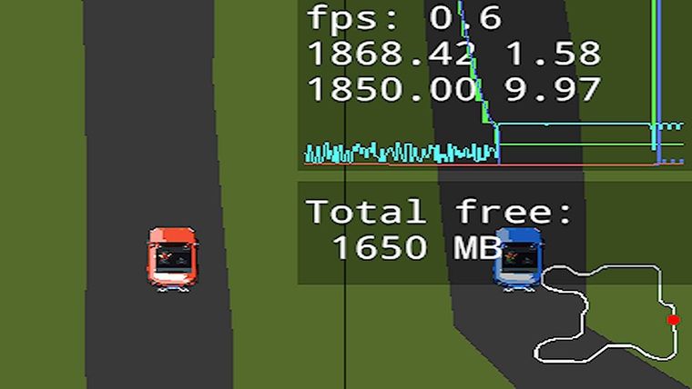
Unfortunately, first try with 2 players was a total fail:
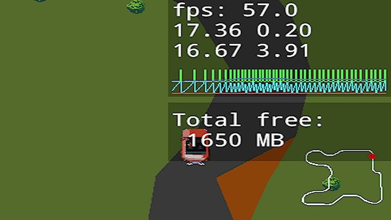
1 player: nearly 60 fps
2 players: not even 1 fps! XD

-
That green line on the graph has gone right off the top of the screen!
-
I like the touch of showing the HUD of the track : ) Nice work!
-
The track layout's familiar. Is it Autumn Ring?